
 By
By If you are a designer or developer, you may already know that using appropriate colours while creating a site can make a huge difference. It will help make the site visually appealing and improve user experience. However, after choosing the right website colour scheme, it is also hard enough to decide where to use that colour and where not. This is where 60 30 10 colour rule web design saves you.
Simply put, applying 60 30 10 colour rules in web design is the simplest way to create harmony. It also saves you time.
Wants to know, what is the 60-30-10 rule and how to apply it in a website design?
If so, don’t go anywhere; just keep reading to find the answer to your concerns.
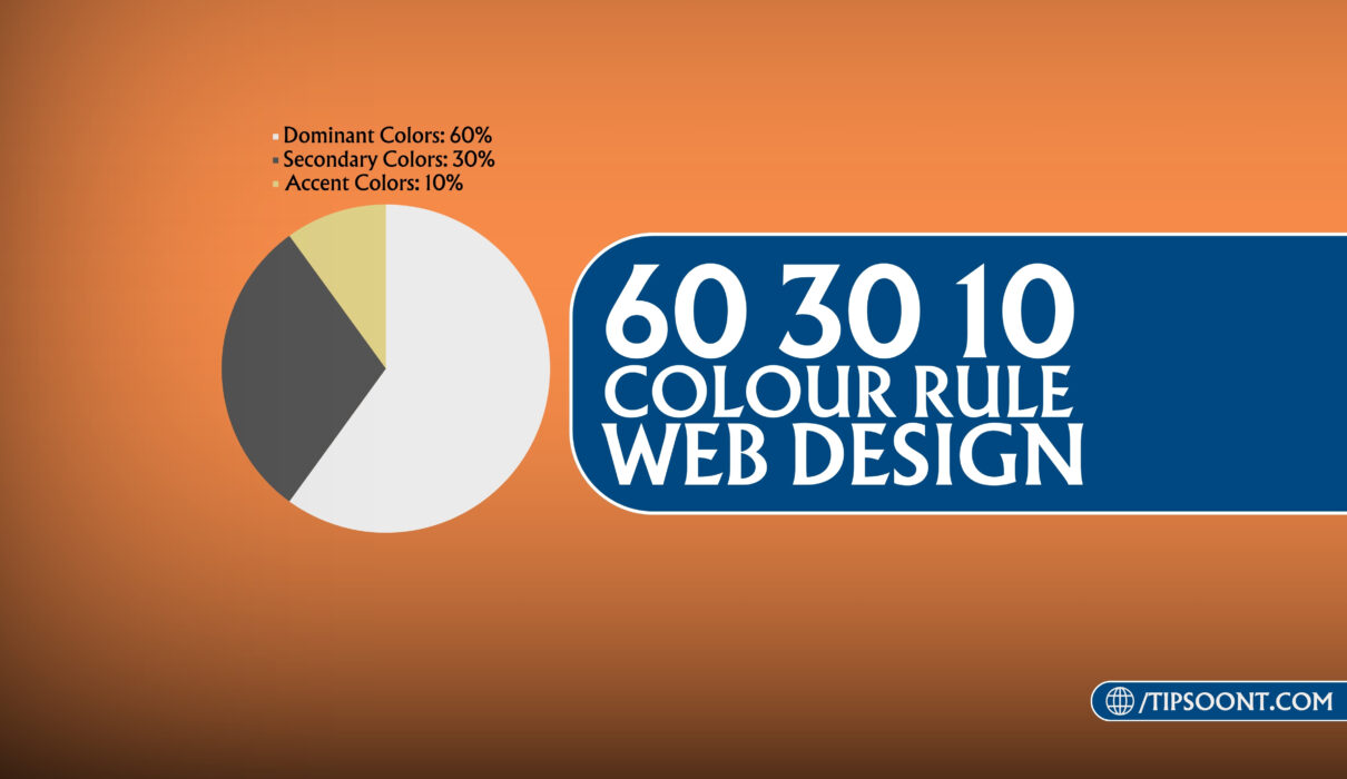
What is the 60-30-10 Rule?
The 60-30-10 is a design rule used by interior designers, graphic designers or even fashion designers to achieve a balanced and visually appealing design.
This colour rule states that the colours should be used in the following proportion.
- 60% Dominant Color: This represents the primary colour in the design, typically covering the largest area. It sets the overall tone and establishes the mood of the space. That’s why also considered as the base colour of the design.
- 30% Secondary Color: This colour complements the dominant colour. It adds visual interest and helps to balance the dominant colour without overwhelming the space.
- 10% Accent Color: This is a bold or contrasting colour used sparingly to add pops of excitement and personality to the room.
What is the 60-30-10 Rule In Web Design?
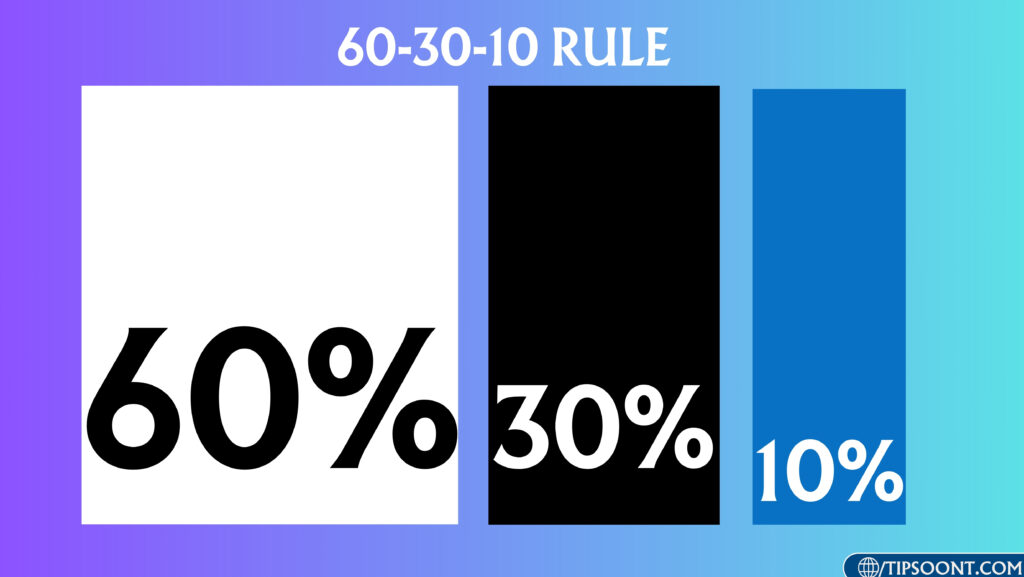
If we consider this 60 30 10 colour rule in web design then it can be referred to as;
- The 60% of your website’s colour must be neutral and used widely. It could include the main text, images, or any other primary information users will likely seek when visiting the page.
- 30% of the remaining colours will still be prominent enough to use on a medium important component. It might include sidebars, navigation menus, related links, or secondary information that supports the main content without overshadowing it.
- The remaining 10% is the accent colour. You can use this portion to highlight the important points of your design. It could include calls to action, social media links, advertisements, or other less critical elements that still contribute to the overall functionality and engagement of the website or webpage.
How to Apply 60 30 10 Rule in Website UI?
Applying the 60-30-10 rule in a website involves strategically allocating different types of content and elements to create a visually appealing and user-friendly website.
Here is the complete step-by-step guide you need to follow.
60% – Dominant Colors:
This area should be dedicated to the main content or functionality of the interface. It’s where users spend most of their time and where the primary action or information is presented. The dominant hue of your website can include the background, header, footer or design elements that are the centre of attraction to the point.
For example, in a messaging app, this might be the area where users compose and read messages.
So, before choosing a dominant colour, we highly suggest you use a neutral colour like white, light grey, or beige for the overall background. This creates a clean and spacious feel and allows a website’s content to stand out.
30% – Secondary Colors:
Once you apply dominant colours, it’s time to utilise secondary colours to complement the website.
For example, you can employ the secondary colours on navigation bars, menus, dropdowns and sidebars to define user paths and differentiate them from the main content. Later apply 30% colours on borders, dividers and separators to create structure and organisation without distracting from the content.
Lastly, apply this hue on hover effects, button guides, or user interaction points without overwhelming the design.
10% – Accent Colors:
Last but not the minor, the accent colour portion consists of smaller elements that enhance user experience.
So, apply these vibrant colours for crucial actions you want users to take, like “sign up,” “Read More,” or “Contact Us” buttons. You can also use these colours for key information, error messages, or success notifications to draw attention and guide users.
Additional Tips To Effectively Apply 60 30 10 Rule in a Design:
- Prioritise the primary content and ensure it receives the most prominent placement and visual emphasis.
- Use supporting elements to guide users and provide context or additional options without distracting from the primary content.
- Reserve accent or supplementary elements for important actions or features that enhance usability or engagement.
- Maintain consistency in design elements such as typography, colour schemes, and spacing to create a cohesive and visually appealing interface.
- Regularly test and gather user feedback to refine and improve the UI design based on their preferences and needs.
Final Words:
In conclusion, the 60-30-10 rule in web design should be considered a guideline, not a strict rule. So, adjust the proportions based on your design aesthetic and needs.
Lastly, don’t be afraid to experiment with different colour combinations and see what works best for your specific design. You can also share your best design tip in the comments below.
Till Next!
I am Sure You'll learn Alot..
- Autoptimize vs WP Rocket: Pass Your Core Web Vitals! - January 14, 2025
- How to Hide Page Title in WordPress Elementor (2 Simple Methods) - December 21, 2024
- How to Rename Images in WordPress (Change After Uploading) - December 20, 2024


