
Choosing a website colour scheme might seem daunting, but at the same time, it’s interesting. On the other hand, everyone has different colour choices, but it doesn’t mean you will put those colours on your site.
Because the colour scheme is a crucial step, and before choosing any colour palette, you have to consider lots of things, and after the answer, you will be good to go towards the creation process.
So, today in this guide, we will discuss everything you need to know before choosing a perfect colour palate.
What is a Website Colour Scheme?
It’s pretty simple to understand the concept of a website colour scheme, but if you are a beginner, let us explain it.
A Colour scheme is a collection of colors chosen by the designer before creating a website.
Well, it’s not easy to choose from thousands of potential colour combinations, Right?
So, the good news is you can use a colour palette generator to get incredible and exciting ideas. But, it doesn’t mean you will get a perfect combination through those tools; you still must apply some brainstorming for excellent delivery.
For example: put the SS of eBay, Facebook, daraz, or any other site you might like.
Importance of a Colour Scheme for Websites?
Before jumping into the significant website colours, let’s look at the importance of having a colour palette for your website.
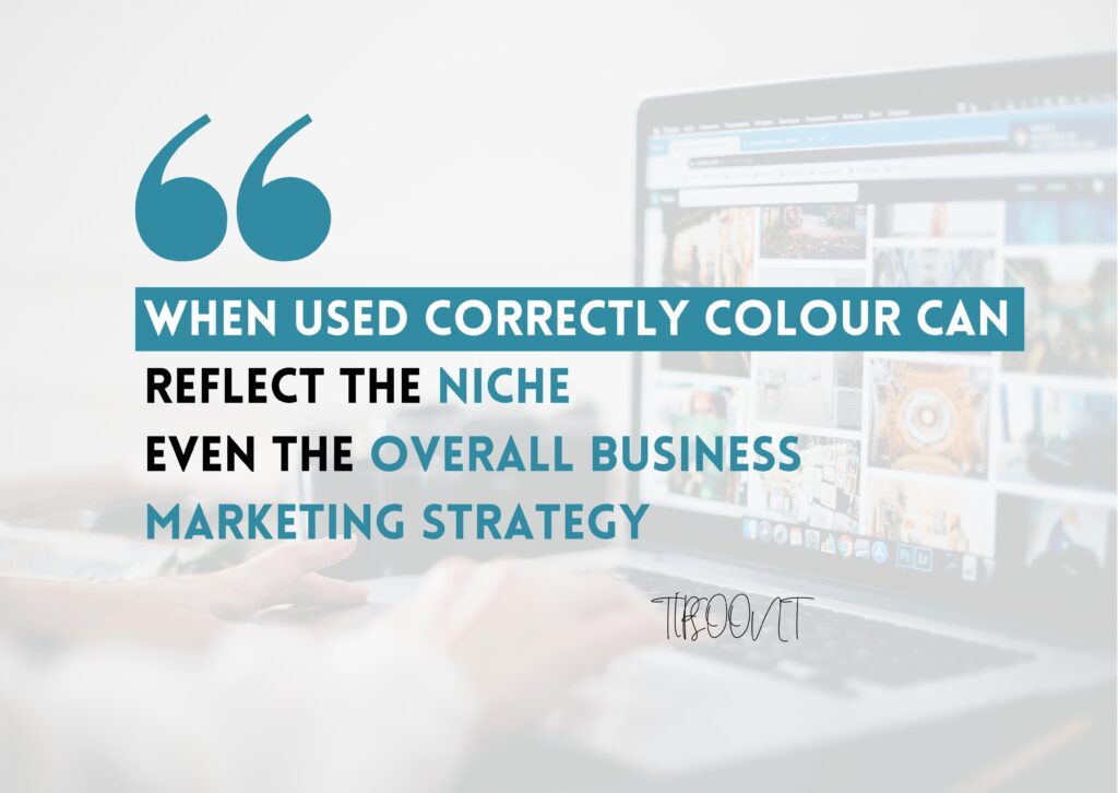
- It’s human psychology that colour attracts them. You also might remember some sites; you don’t even remember their name, but just because the colour attracts you, that’s why you remember. So, having attractive colours will help you to create your brand recognition.
- Most importantly, the website design helps the reader to figure out that they have landed on the same website without knowing the name.
- Also, an engaging colour scheme will help create colour psychology because the colours affect the reader to influence their decision. As it’s the design or colour which pursue the reader to take a specific action
Wait! Are you thinking of website-only content matters? Yes, to some extent, you are right but let’s say you are jumping into any website. What would you consider first? Yep, the design of a website. Does it attract you or not? So, despite having great content, you can’t ignore the importance of a colour scheme for your website.
Famous colour schemes
A colour scheme can perform wonders for your site, especially regarding engagement. That’s why you must be careful to choose from exactly and figure out what will convey the emotions.
So, let’s look at some of the most famous colours used on any site.
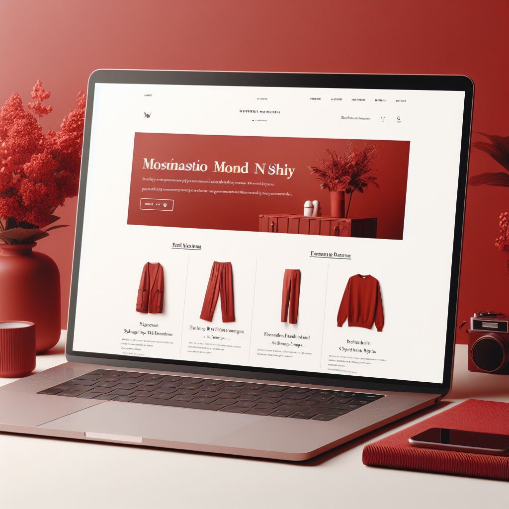
1- Red Colored Website
Usually indicates that you need something badly. That’s why this colour scheme is mainly used by restaurants or eCommerce site owners – So; red means speed, energy, and passion for something.
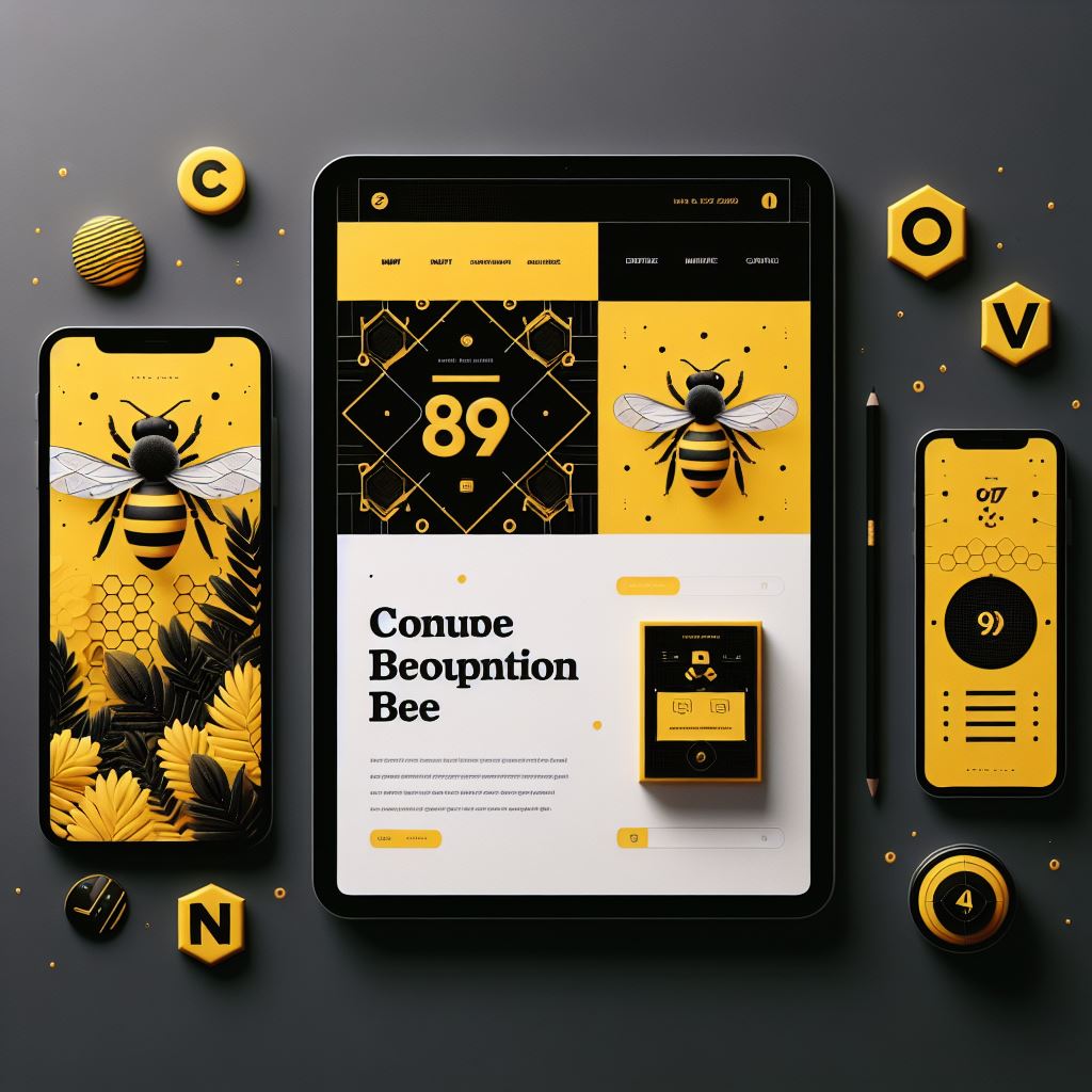
2- Yellow Colored Website
Yellow is a great colour indicating that you are accessible and eager to help the reader; that’s why the service industry mainly uses this colour scheme – So, yellow means positivity and warmth.
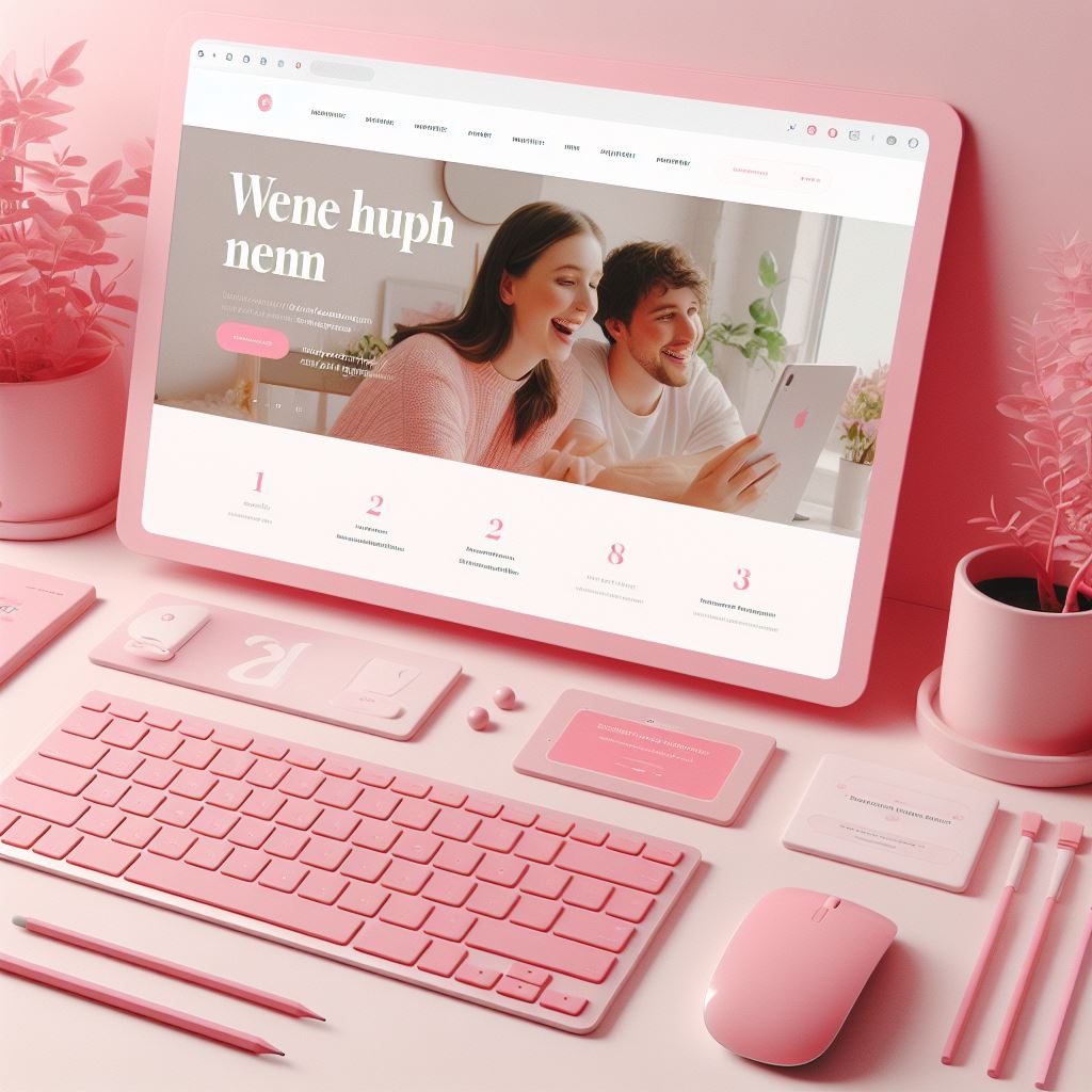
3- Pink Colored Website
The most beloved colour by both genders. You will be surprised to know that beauty products or skincare brands widely use this colour. Pink with the association of skin or skin colour will attract readers.

4- Black Colored Website
It is becoming popular nowadays, and the reason behind this is that it usually shows that they have a quality product, and this idea is justifying enough.
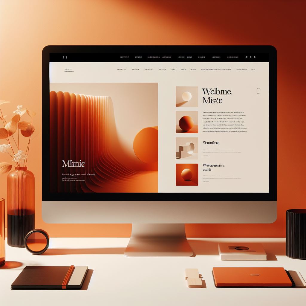
5- Orange Colored Website
The orange colour websites give a visible look because of their vibrant colour. Orange colour is widely used in today’s marketing techniques, especially by safety equipment and clothing brands.
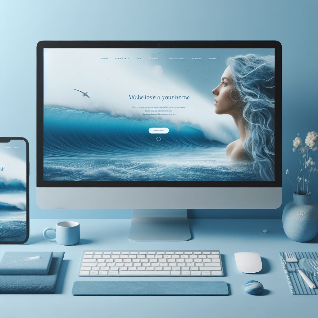
6- Blue Colored Website
It is acceptable by 50% of its users, building its reputation. Business and financial websites use these colours more widely as compared to others.
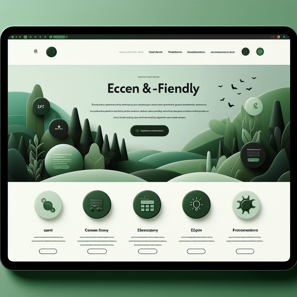
7- Green Colored Website
Green is a perfect colour to show the brand’s calming and natural look. It’s not very popular, but it’s a perfect colour for conveying eco-friendliness. It can also symbolize growth and prosperity, ideal for businesses focused on finance or personal development.
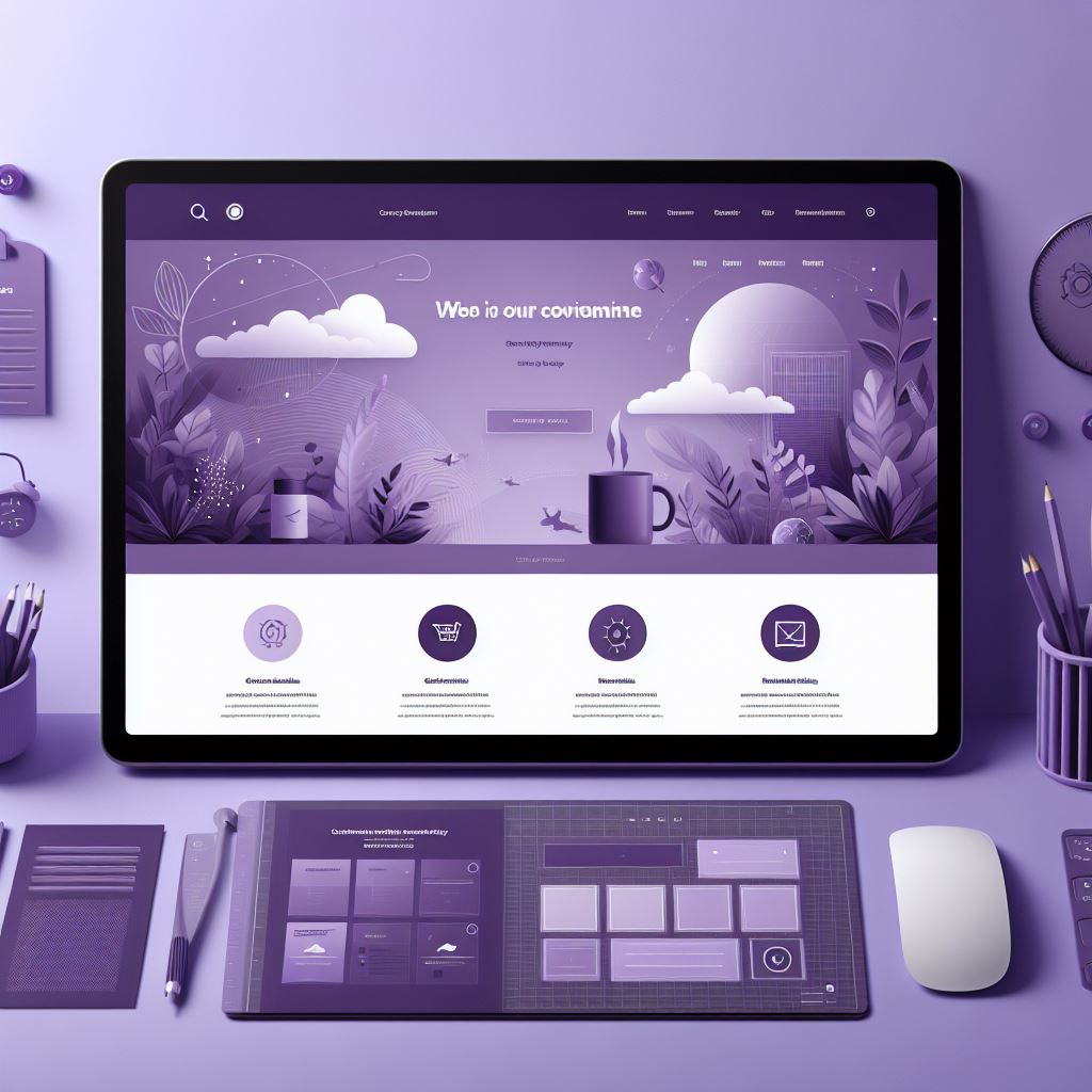
8- Purple Colored Website
The most vibrant colour that demands attention and is widely used where the site owner wants to require any attention. So, if you’re going to stand out, use this in your colour palate.
Most importantly, a colour palate usually helps the reader perform differently. That’s why you have to be very careful while choosing. Also, don’t forget to consider your KPIs.
Well, if you are wondering how you would apply your colour schemes. Don’t worry; we have a precise guide on this. Just keep reading.
Top 5 Website Color Combinations For Your Design
Choosing a website color scheme can be both exciting and exhausting because its not much easy to pick as it seems. With so many options available, it’s easy to get overwhelmed. But fear not! Here are 5 of the top website color schemes to inspire your design, categorized to suit various goals:
1. Classic and Trustworthy
- White and Black: This timeless combination exudes elegance, sophistication, and professionalism. Perfect for websites that prioritize trust and clarity, like law firms or financial institutions.
- Blue and White: Blue evokes feelings of trust, security, and calmness. Pairing it with white enhances these qualities, making it ideal for healthcare or technology websites.
2. Vibrant and Energetic
- Bright Green and Hot Pink: This bold combination is guaranteed to grab attention. It injects energy and excitement, perfect for websites promoting fitness products or children’s toys.
- Orange and Teal: This playful scheme is both bold and refreshing. It’s great for websites in creative fields like design or marketing agencies.
3. Natural and Earthy
- Dark Green, Ivory, and Yellow: Inspired by nature, this scheme evokes feelings of peace, tranquility, and growth. Ideal for websites promoting organic products or eco-friendly services.
- Beige and Brown: Earthy tones create a sense of warmth, stability, and comfort. This scheme works well for websites selling home goods or agricultural products.
4. Modern and Sleek
- Black and Neon Blue: This combination exudes a modern and futuristic vibe. It’s perfect for tech startups or websites with a focus on innovation.
- Grey and White: Clean and minimal, this scheme conveys a sense of sophistication and professionalism. It’s a versatile choice for websites across various industries.
5. Warm and Inviting
- Beige and Red: The warmth of beige balances the boldness of red, creating a welcoming and inviting atmosphere. This scheme works well for hospitality websites or businesses promoting comfort food.
- Yellow and Blue: Yellow brings a touch of cheerfulness, while blue adds a calming element. This combination creates a friendly and approachable feel, suitable for family-oriented websites or educational institutions.
How to Apply Colour Schemes to Your Website?

Well, now you have chosen a colour scheme for your website, but you are confused about how you can apply it. No more worries; Tipsoont is here with their team for exquisite tips.
Of course, it’s not that difficult, so without further ado, let’s start.
Yep, you heard it right. You are worried; what does it mean? So, let’s explore the exciting answer. First, while creating a website, you need to apply a 60/30/10 rule.
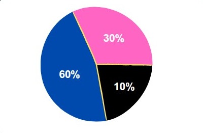
As you all know, a website often has a colour scheme combining 3 colours. After choosing colours, you need to apply this rule.
- Let’s say you have a colour scheme of blue, pink, and black
- And here, you would apply this rule by considering 60% blue, 30% pink, and 10% of black.
- While blue will act as a dominant colour, pink as a complementary colour, and black as an accent.
Cool! You have created an exquisite design for your brand website. Congrats, and let’s move on to our short final verdict.
Final Words
To end this guide, we hope that it will be fair enough to help you get to know everything you need about a colour scheme.
So, roll up your sleeves and start creating yours, but we have a tip for you before ending this.
Tip: Undoubtedly, you will not get the perfect colour palate. First, you need to try again and again to make this daunting process easy; some tools are available where you can test your website colour scheme before finalizing it.
That’s it for today; we would be more than happy if you would share your creations in the comment section.
You May Like These Articles
After building your dream website the next step is to rank your website in front of your target audience who is searching for services that can be related to your business.
Thats why you should know What is WordPress SEO | Tips to Improve Your Ranking OR Why a Website is Important for Everyone? Top 9 Reasons to Consider
Till Next!

Do Subscribe the Newsletter and Push Notification Because we'll share premium knowledge about web here for free.


1 Comment