Satisfaction of Clients is the Top one in Business, especially In Internet base Businesses that’s why our final product should be as good as can. Now we’ll discuss the Website means after Designing the 8 best ways to make the WordPress website look professional.
According to stats, over 1.7 billion websites exist, less than 200 million of those websites are active, and around 576,000 New Websites Per Day. read complete articles here. And the same In freelance marketplace a massive number of website Designers are there waiting for a project. So, we have to make our website professional to stand out.
8 Simple Steps to Make Website Look Professional
Usually, there are millions of points we can add here and every click of a website designer makes the website better but I’ve noted some points normally ignored in website designing which can make out website design more good looking for you or your Clients last time we have discussed the Delivery of a website you can read this article and Implement steps mentioned in the article it ll give also an attractive and Neat look to your website when your website will.
Be professional and have some positive points as compared to others then there is a high chance to get more clients and regular clients so Let’s discuss some magical points here.
1) Custom Domain and Hosting
When you design a website the first requirement is domain and hosting you can read all the basic requirements of the website also. Sometimes people ignore the importance of a custom domain and Start using a normal domain with a subdomain, especially for users of Blogger, etc.
A free domain like abc.blogspot.com abc.wordpress.com etc is not a professional approach and Google also doesn’t like this scenario. SO Custom Domain with Custom Email. like tipsoont.com is the Domain of this blog and admin@tipsoont.com is an email account for this.
to understand the domain name I have an Image for you
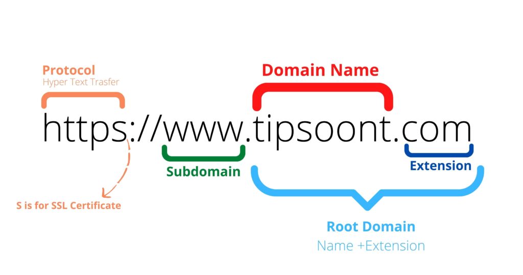
So to make the WordPress website design professional stand out by using a Custom domain and good hosting and then it’ll also help in ranking and SEO factors
Hosting plays also an important role in a website If Your Website will Load quickly then viewers will interact with the website Your hosting service should be Professional and Affordable. Google will discourage your website and make it difficult to rank with slow speed That’s why I recommend using Optimal Host and if you are confused about selecting a hosting Service Provider I have a recommendation.
I am using a Host for my all websites and clients also Click on the Banner below to get a reliable host for your website.
2) Customized Theme Design
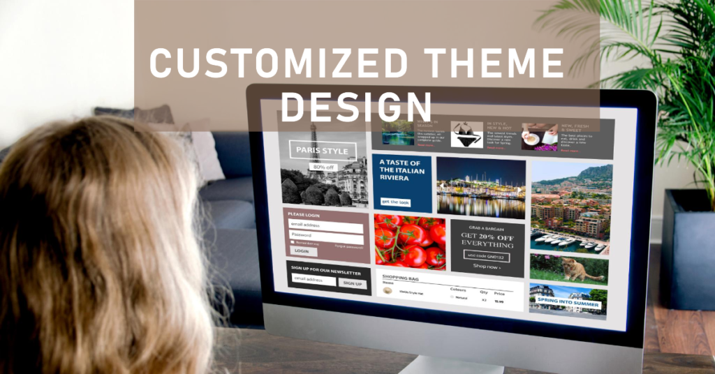
Normally we use an SImplete Pre Installed theme or some famous theme like Astra etc without such customizations which is not good especially when you are acting as a Service provider or freelancer You should take care.
Your Design should be edited and customized to change the default look of the theme according to the Color Scheme and requirements Don’t use Stock Design 100% use it but with Modification.
Another Important point is Normally designers use Crack themes for websites instead Of paying a few US dollars the Drawback of crack themes is very dangerous like data Loss, High jacking, Hacking, No speed optimization, etc.
Paid themes will be optimized and REsponsive also if you want to read an article on Free vs Paid themes then comment down and I’ll try my best It is highly recommended to use the Official theme from the WordPress directory or Purchase legally You can use Envato market base Theme Forest to purchase a WordPress theme.
3) Custom Favicon
A very important point with very small functionality Is favicon. A small version of the logo is shown at the top Bar of the browser in the tab Section. By default, the icon is the logo of your CMS if you are using WordPress then it’ll appear and not look good and professional and a customized Favicon can make your website’s tab Unique in all tabs you can see a TIpsoont logo in the tab.
Some Recommendations about Favicon
Use PNG(Portable Network Graphics) Images for favicon because in these Images your logo will be transparent and without a background which makes It more Clear and distinct PNG images can Deliver High-quality graphics and Try to use dark colors. you can see it in the Images below. You can design a Simple Icon using Canva.

If your website is not based On a logo you can use alphabets Characters like the First character of your domain In my case it’ll be “T” You can design this favicon using this tool.
All favicons 1 Based on the logo and 2nd on Characters 3rd By default are in the image Below
You should go for customized and Professional favicons to make your website unique and professional. Favicons help us to find specific Websites from all tabs and the First thing to show about the website is Favicon.
4) Use of White Space
Whitespace in website design makes websites look spacious and easy to stay on the website for a long duration for article reading etc. So Use ample white space to make your content easy to read. Website of the 80s was built such designs that are not compatible today, especially websites of social media agencies, advertisement agencies, etc.
SO Use white space in your design content and margin etc Now we’ll compare some websites to make it easy
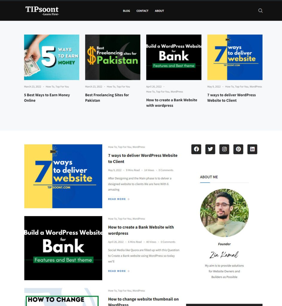
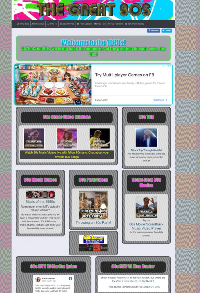
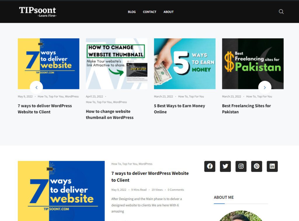
You can see the difference between websites using a customized theme and White Space to look specious and make content easy to read.
5) Responsive Desing
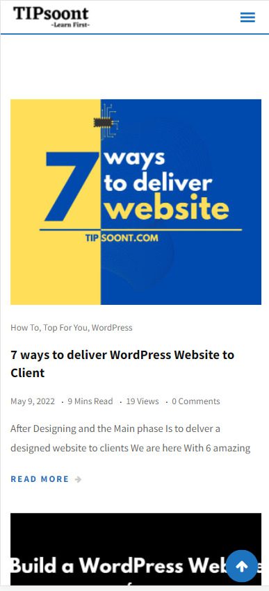
Nowadays the highest Demand of clients in a Responsive Desing. Responsive design means your website should be easily readable and communicateable on all devices like desktops, Tablets, and Mobile. Most owners make the mistake of underestimating the responsiveness of the website.
According to Analytics of Website, 60% of traffic comes from mobile and that’s why we have to focus on Responsive design. You can purchase a theme With default responsiveness or customize it according to the Device.
Here is an example of responsiveness
While surfing the internet I’ve seen some website’s footers with default text and With Normal design. to make your website very professional you have to customize the footer with the website logo Navigations Link and CC text.
When someone Scrolls the website till the end there should be a button to reach the top with One Click and an Important link In the footer is also very important to connect your Whole website and the user can communicate with the website easily.

7) Copyright Free Images and Videos
Most people don’t know about images right they just type keywords on Google and then Pic an Image and paste it to a website which is the wrong approach Because the real owner of the image can sand strike on this and Sometimes Image quality is also compromised.
To make the website good-looking you should pick Copyright-free images and Videos with high-quality Graphics you can use Pixabay and Pexels and Make sure to customize it using Canva. The Images will have high-quality graphics and are highly recommended to use.
8) Amount of Ads
The last point of this article is the number of ads. Normally websites use too many ads and it becomes very difficult to interact with the website So to look professional You have to use ads at a limit to the normal Amount of Ads to make the WordPress Website look Professional.
Normally I used ONe or 2 ads in articles according to the shape etc on a different website.
ProTIP: If you are on a website with a lot of ads and it is very difficult to read the content then you can use an Extention Mercury Reader.
It was 8 Amazing Points to make your Website so Much more Professional for yourself and your client. if you want to add something write it down in a Comment and Soon I’ll record a video also.
For your suggestions write down the Comment box.
You May Also Like: How to Create a Bank Website with WordPress OR Requirements of Website Step-by-Step
Thanks
- How to Cancel an Invoice on PayPal: A Step-by-Step Guide - August 28, 2025
- How to Enable And Disable Comments in WordPress:2025 Update - August 28, 2025
- An Ultimate Guide to WordPress Featured Image Sizes:2025 update - August 27, 2025




3 Comments